The High Road’s Book Trailer

I love book trailers… but I hate videos, or at least how easily they can end up padding themselves out without a real reason for the extra minutes. So that puts me in a fun place now that the time’s here to get my own trailer for The High Road.


Training for the Trailer

You don’t have to be a writer to see the logic that makes a trailer. Of course that’s what a trailer is: taking the arcs and the sizzle of storytelling, and arranging them so someone can “know” the story in a minute. It’s distilling the tale.

And I do love that challenge. After all, Shadowed has completely different back-cover and inside-cover copy (“Paul lives in hiding… the one person who knows…” vs “Open your mind… take another look”) simply because I got into writing both. So how many plot points does a trailer need? How many words, to leave how many pauses in a timeframe?

But then making the video itself? No way I’d do that.

I’d either lose weeks learning the software and hating the result, or lose weeks learning the process and love it too much to ever finish. I always knew I’d start with the script and then work with an expert to get the final result. So instead I studied trailers like Joanna Penn’s advice at http://www.thecreativepenn.com/2015/03/02/book-trailers/ and http://www.thecreativepenn.com/2011/01/07/how-to-create-a-book-trailer/ and looked at what could work. Then I went shopping.

The result?


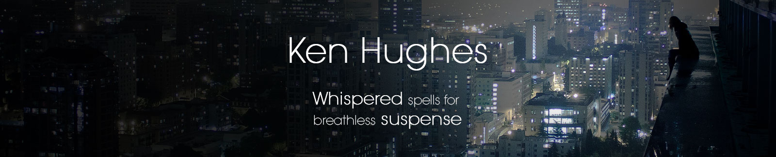
So what do you think? Do the skyline and cloud images, and how they alternate with fire and destruction, make the point about the joy of flying and the dangers Mark and Angie are in? Should more of the cityscapes have been at night (when most of the flying happens), or does the light/dark contrast work better on a visual level?

I think there’s a lot to like here.

Especially, I like that it keeps to 45 seconds instead of the two to three minutes of so many trailers—both book and movie. It always bugs me when a video fills up time with less inspired content, figuring that just making it visual means every second is earning its keep. (A lesson we writers are relearning with every line we write!) And a trailer isn’t like the recorded clips I’ve put up, for a fan who wants to follow a page of my writing with their own ears. No, it ought to hook, and re-hook, the viewer with every line.


Ahead on the Trailer Track

If you take another look at Joanna’s above, and compare, I think we did okay for our first time out. Similar lengths, and a lot of similar arcs and techniques.

Or there are longer, more detailed trailers out there, like for Hugh Howey’s classic Wool at https://www.youtube.com/watch?v=8-ardca2IAg

Of course that one takes the leap to using custom-built images for every shot, from the View Outside to the computer readings… enough to make me pound my fists and wish for a bigger budget. But there’s no question the words and the images follow a story, the distillation of what we need to know about Jules’s world.

(On the other hand, Hugh himself has some thoughts about the art of trailer-making, and what might be shaking it up soon: http://www.hughhowey.com/this-is-only-the-beginning/ )

Or there’s the all-out cinematic approach, like some of Jim Butcher’s fans did for Skin Game: https://www.youtube.com/watch?v=x8ZUvrIQWuY

That’s a full three minutes with actors, staged moments, and everything else it needs to convince us this Dresden Files book is a film out there (well, why isn’t it?). Shifting storms, characters set up to show their conflicts with each other in a few shouted words… or a burning subtitle to introduce their roles in the heist Harry gets trapped in.

(If anything, the last glimpses on the trailer might be too fan-centric. You need to know the other books to see why Michael Carpenter defending his home is such a big deal, and you need to have already read this one to appreciate how that moment’s not part of the caper but the dread aftermath. Still, how could they not have referenced a scene that got as wild as that one, even if they stayed clear of the real spoilers…)

It all gives me a lot to mull over. I think I’m getting the hang of picking the words to tell a story in trailer form… the next step could be to go further in matching images to the pieces.

  • Should there be more moments, more pieces of words and story elements along the way?
  • Or less? (For more oomph for each.)
  • Onscreen text instead of voiceovers? Or a mix, like some of Joanna’s?

And then there’s the other trailer. The one Ilona Andrews made to make fun of trailers themselves: https://www.youtube.com/watch?v=AMxG1ayUAOw

“Cheesy,” it calls them. There’s truth to that; book trailers try so hard to say so much quickly, they do have a bit of absurdity to them. Then again, even a parody like this has to know what it’s spoofing… and a good skewering does help me remember what matters. Like memorable moments that (should) string together to imply the story, good visuals or phrases that hook in their own right…

I won’t need quite so many cute kittens, though. Unless I could get a shot of a kitten touching someone and possessing him.


On Google

A little Summer Reading

CONFESSIONS of SYLVA SLASHER by Ace Antonio Hall

Sylva Slasher

SPRING BREAK GETS WILD ON THE LIVELIEST CRUISE IN THE PACIFIC UNTIL THE UNDEAD CRASH THE PARTY.

Eighteen-year-old Sylva Fleischer and her friends raise the dead for a living for police investigations and mourning families. Two years after her high school crush, a hot guy named Brandon, is assumed dead, Sylva’s friends convince her to go on a spring break cruise in an effort to suppress her depression over him. But when passengers mysteriously die and reanimate into flesheating zombies like she’s never seen before, Sylva plunges into a horrifying struggle between a ship infested with the undead and the scariest thing of all: a second chance with Brandon after she discovers he’s still alive. This is a zombie story that eats right to the core and leaves you licking your chops for more.

Got zombies? Sylva Slasher does…

–click for more

About the author:

Ace Antonio Hall graduated from Long Island University with a BFA. He is a former NYC middleschool English teacher that now resides in Los Angeles. Ace’s short story dead chick walking made the Fall 2013 edition of the best-selling Calliope Magazine and his science fiction story, they, won the Honorable Mention distinction for the 2013 Writers of the Future Award. For updates and news, follow him on Twitter @aceantoniohall or visit www.aceantoniohall.com


BLOOD LINE by Lynn Ward

Bloodline

Lauren Pell is chief of security for the Terran station on Krhyllan, a planet wracked by ancient feuds and hatreds. When the king’s young son Deran is attacked by the savage Blood Painter assassins, the feared Blood Painters, Lauren fights, schemes, defies—whatever it takes to rescue him.

Convinced she failed to save the life of her own child, she will save this one, even if revealing some secrets endangers Krhyllan itself.

–click for more

About the author:

Lynn Ward is a native Texan recently transplanted to California. A speech pathologist in her day job, she reads, does martial arts and humors a neurotic cat. Blood Line is her first novel, after having sold short fiction in the past. Currently, she is working on a new novel and exploring the wilds of Los Angeles.


MAMA by Robin Morris

As the Conover family drives from L.A. to Chicago strange things begin to happen. Nine year old Michael sees a face form in the window of the family car. Two creepy children stare at fourteen year old Alison at a motel. A car follows the family for many miles, then hits their car and drives away.

Wherever the Conover family goes, wherever they look, they see a large woman and her children coming closer. The woman and her children are superhumanly strong. They can enter a locked room without opening the door.

Confused and scared, the Conovers can’t comprehend what is happening to them. Everywhere they turn they see the woman and her children. The woman is Mama, and as she teaches her children, like a lioness teaching her cubs to hunt, the Conovers realize that they are the prey.

–click for more

About the Author:

Robin Morris has had stories published in print anthologies and on the web. She collected many of her stories in “Halloween Sky and Other Nightmares.” This is her first novel.

Christa, a shy college student, is interning at a Chicago law firm. One morning, she spots a mysterious stranger across the street from her office. This seemingly casual incident tears Christa from her world and sends her into a terrifying struggle with the remorseless immortal, Mack.

Mack comes from another time and place, not so long ago in years, but very far from Christa’s urban world. Mack came of age in the era of bootlegging, where the strong took what they needed to survive, and he has become interested in Christa.

On a trip to Europe, Christa comes across evidence of the supernatural, which she tries hard to ignore, but on her return she ends up being trapped in a clandestine network where human blood is farmed to satisfy vampire thirst.

Soon she becomes caught in a power struggle between two covens, a fight that threatens her mortal existence and forces her to make choices leading her into a deeper understanding of humanity and her own soul.

This is not a love story.

Prey is a novella and has a word count of 35,000 words.

–click for more

Katy Mann grew up in the Midwest where she attended the University of Chicago. She moved to California with her tabby cat, Gus, in 1995. A life-long reader, she divides her time between the real world, when necessary, and the worlds created in books and her imagination, when possible.

The High Road cover reveal

Getting a cover for a book I’ve written is well beyond feeling like a “kid in a candy store.” For The High Road it was closer to Christmas morning… if you’d spent months and months living the creation of what you’re going to use your present for… and if you’d sent off your Wish List knowing this Santa Claus was guaranteed to read it and use all his skill to make you the perfect toy.

Yeah, it’s that cool. If it works.

Since I’d already decided to spring for a full-value cover, one of the key questions became choosing the right St. Nick. And this step I simply lucked into. Friends at the Greater Los Angeles Writers Society suggested one service that has a history of award-winning covers for fairly affordable prices: Damonza.com. Plus, when I began searching Joanna Penn’s suggestions for different designers at http://www.thecreativepenn.com/bookcoverdesign/, it didn’t hurt that Damonza was at the top of her long and varied list.

But the other part is planning just what I wanted in my cover. And, even though I had a first choice for a designer, working out my plans was the best way to check just how good they’d be.


Judging a Cover by its Book

So just where do you start, learning to see a stack of words as a single picture?

–Alright, let’s be honest. It’s more, how do you un-see all the pictures you’ve got and find what parts of them really matter?

As a reader (geek and general crazy person) I’ve got a lifetime of colorful covers on my shelves, plus movies, TV, and comics for more exposure to what puts a story into a frame. The real work is backtracking from my assumptions and trying to find what a good designer needs.

(See what I always think of as the Engineer’s Question, from Spider Robinson’s Stardance: get past a user’s assumptions of what a thing should “be” and ask “What do you want it to do?”)

After asking friends, remembering author interviews, and digging around the net, I found that a lot of the best early-stage advice fits neatly into one handy blog post: Anna Lewis at Publishing Talk, http://www.publishingtalk.eu/self-publishing/four-steps-to-create-a-great-book-cover/. Her method begins with a “mood board” of related images, and a study of other covers of similar books.

–She continues the process with DIY steps for getting good images and learning how many formats the cover needs to be in. These would be the points where I’d switch from doing the work myself to helping out the designer and just checking how well they’d handle them.

Mood, and examples? The mood for The High Road was no secret to me: it’s all about thrills. In fact, it’s about taking that to the edge of desperation Mark and Angie have knowing that one gravity-controlling belt isn’t enough to put down an organized gang of enemies with worse things behind them.

Other covers? My search for good samples started on my own shelves, on Amazon genre lists, and on the scores of varied (and very awesome) covers on the Damonza site. A cover artist that doesn’t encourage you to think in terms of the other covers out there isn’t doing his job—but Damonza both asks and emphasizes the value of that, so points for them.

–Sub-point: Anna Lewis makes it clear that the covers to study have to be for the right genre; no matter how many dark alleys my characters use, they don’t see them the same way as an (earthbound) mystery hero does, and the cover shouldn’t either. And if you want to go deeper into that, check out the writer juggernaut Kristine Kathryn Rusch in her exploration of how to re-invent cover styles for a genre: http://kriswrites.com/2015/07/22/business-musings-the-branding-surprise/


What’s worth NINETY thousand words?

Now for the heart of it: what kind of image should the cover be?

(Note, that means images, not “what scene should it capture.” That’s another piece of advice that turns up often, how all the treasured specific moments in a book are usually too complex to make good cover material. It’s also another point Damonza makes very clear to a client.)

That might be the fastest choice I ever made about The High Road. This is a book about flying—it’s meant to be the book about someone flying. Sure there’s also Mark deep in the woods or racing through the hospital, or Angie’s signature gaze looking for a horizon, or her toppling a car… but who am I kidding?

Flying. Done.

But what kind of flying, and what other images are part of that?

And here can begin the most varied, complex, and fun part of cover planning: just how far you can mine your own imagination, but meshing it with someone who should know everything except the book itself far better than you. I already knew what a sweet surprise that could be when another designer helped me with Shadowed.

Shadowed cover

SHADOWED cover (not by Damonza)

For that cover (since I was young and bossy back then) I started with my own very specific concept. That one figure in the crowd that’s so much clearer than the others was my way to suggest how Paul’s senses can pick out a single target, and for all the secrets he’s trying to search through.

And yet, I never even thought of Paul in a hoodie, until this came back. No matter how much fun we writers have imagining a cover, a good designer is a true eye-opener.

The High Road had its own specific cover needs, even though I’d learned not to micromanage parts of it. I wanted to touch on its urban setting and especially its literally dark world—that Mark and Angie know better than to try flying by day and still keep the magic secret. But most of all, there was the problem of “the Superman silhouette:”

I admit, I’m a little smug about having written Damonza into a corner like this. If someone does look up and glimpse a shadow going by at night, generations of comic books mean anyone would at least recognize a human outline stretched out to slide through the air. In the book Angie (being Angie) naturally figured that out, and so when she or Mark fly it’s usually huddled up into a nondescript ball shape that’s easier to take for a balloon or a trick of shadow. But that’s hardly a good dramatic pose for a cover, so I suggested the moment of leaping up or landing might be more promising.

And of course, I was also explaining how Mark was only just learning to control the magic, and the frantic tone I try to build in my scenes.

What I got…

was THIS:

The High Road cover

THE HIGH ROAD cover

One word: Squee!

(Or maybe: “Zha-daruath. Zha-daruath. Zha-daruath, dammit!” if I think of it as him just learning the magic.)

Mark, falling—or desperately dropping—out of the sky. And they did that without even hearing about Chapter Ten, and the moment where he makes a barely-controlled drop down the side of a skyscraper in search of his elusive enemy. (And it’s almost within a page of the section that was so central the first draft made it the flash-forwarded opening page.)

And it hints at the climax too, Mark in so much control that he finds he’s maneuvering around skyscrapers—

And there’s that hint of the nighttime action, but plenty of light to suggest the magic that’s carrying him (without it quite seeming like it’s a visible glow).

And—

And—

Wow.

There’s a reason for Damonza’s tagline: “Books made awesome.”

One part of me thinks it’s going to be a lot easier to make my next round of edits, to be sure the book is good enough for an image like this.

The other part hates slowing down. I just want to show this thing off, and start telling fans how many bits of the story I’m learning to see in it.

Book Covers – Build or Buy and How and Why

Here’s a tasty bit of irony: deciding on a book cover for The High Road has been making me dig past my own surface, and ask some hard questions about what kind of writer I’m trying to be. Both about capturing the appeal of my story, and about my plans and my whole approach to building my career. Deep stuff.

The cover’s always been a writer’s rite of passage. Even after years of living in characters’ heads, there’s something about seeing those words not just “try to paint a picture” but actually appearing in one that makes it more real: I made a frickin’ book here! I’ve heard dozens of stories of authors reveling in that moment, or moaning when some artist mangled it, and I have my own tales of the fun times people have sat down with me and complimented the cover for my other book, Shadowed.

Like Deepik Tuli says, it’s like looking at your own new face (http://magazine.oditty.me/2015/10/24/selecting-my-book-cover-was-like-selecting-a-new-face-for-myself/).

And yet…


How Much Coverage?

Right there on the long list of writing issues that have been knocked on their ear by technology, is how book covers may not mean what we think anymore.

For one thing, us fearless self-publishing types can take full control of something the traditional author has to entrust to the publisher and some talented but very busy artist. In other words, With great power comes the proverbial great responsibility (or as Mark would say based in the book, great disaster if you don’t watch your step). If I got a cover that didn’t do my characters justice, that would make it a self-inflicted wound.

Of course, a proper, quality cover is a basic hurdle of a successful book: Rachel Aaron sums it up neatly, the four basic steps of hooking a reader through the cover, the title, the blurb, and the first page. (See http://thisblogisaploy.blogspot.com/2015/09/writing-wednesdays-cover-title-blurb.html for more.) There’s no way around that.

Or is there?

[bctt tweet=”Every #book needs a good #cover, title, blurb, and first page. Or does it?”]

Maybe today’s book cover isn’t quite as vital, if the book’s natural habitat is in the Amazon jungles (and Kobo forests) more than it’s going to be competing for glances on a shelf. Hugh Howey and Bella Andre (at http://www.hughhowey.com/iconic-cover-art/ by the way) spell out a humbling fact: what looks like a good cover when it’s in your hands will only shrink down to the “Amazon size” of an online poster when you’ved walked back to one hundred feet away.

A hundred feet. Hugh’s point is the need for good but “icon”-type art that makes an impression on that postage-stamp scale. His Exhibit A is 50 Shades of Grey, and how readers simply learned to match its cuff link to what they’d heard about the book. Shades isn’t a typical success story, but it does remind me that covers don’t have to make the first impression any more. And the whole article stirs up two other dimensions in the self-publishing world:

How much time and money would be better spent on getting readers to see that art, rather than fine-tuning the tiny image that’ll greet them if they get there?

And, where’s the exact best balance between those—because I really can take control of that cover, with anything from degrees of outsourcing to total Do It Yourself.


Decisions, DIYcisions…

Could I design my own cover?

Of course I could. One of the perks of my being a steady reader of Joanna Penn is seeing her step-by-step instructions at http://www.thecreativepenn.com/2013/10/20/book-cover-design-ms-word/ that put the total cost for one great method at $80; how many Facebook ads would that savings free up? And the whole technical process can be done in about an hour, if I separate it from the searching and the creative choices that really make or break it.

So forget the fancy “design,” it’s more that: could I plan my own cover, good enough for “Amazon size,” without ruining it?

It’s the kind of question that starts whole voices in a hapless author’s head.

“But I’m not an artist!”

I can barely make my handwriting readable, and I’m thinking of entrusting the “face” of Mark and Angie and all the rest to my own anemic sense of visuals? After all the effort and all the hope I put into the story and the series, this is no time to forget what I’m here for.

“But it’s only choices.”

There are only so many kinds of layout out there, and background types, and combined with the right foreground image… I can start to see a cover lining up as just one decision after another, with each step not as hard as it looks. And all the time I spend writing my books is also learning to see each scene’s walls and skies and people and how they fit together. I love showing off the art I got for Shadowed, but what if I made The High Road completely my own?

And that’s only the start of what that choice brings up. With so many steps in building a cover, each one is a chance to spend or save more time and money, and they’re all tied into how I see the book, and myself. Could I make a simpler cover, because I don’t know how many people will see it if I don’t save up for ads and networking? Could I split the difference by hiring someone to find the perfect central image, and do the rest by common sense? Are covers even something I should be getting that deep into, when I’m a wordsmith instead of an artist?

(And of course: Mark Petrie, at the center of The High Road, actually is a would-be artist among his other dabblings. I swear I didn’t plan it that way…)


My Answer

Tempting as it is, the notion of a self-made cover feels wrong to me. The odds are I could assemble a decent picture and call it “good enough”—but I don’t want to say “enough” and think The High Road is never going to be famous enough for the cover to matter. Because I think it will be.

Besides, putting a cover on a book isn’t only an investment: it’s a reward. It’s a gift we writers can give ourselves for finishing the story, of a kind we can share with the reader. And I swear, when I look at Michael Whelan’s classic creations and all the other people I’ll never be able to draw like, I wonder if the book is partly an excuse to get some awesome artist to give me their time.

(And if I’m not big enough to lure Mr. Whelan into some contemporary fantasy yet, that’s just one more thing to aspire to.)

That’s my own decision about what a cover means to me, and how it balances with the rest of the book launching process. If any of you visiting authors have worked through the same logic and put the balance at a different place, I’ll be delighted to get a Comment or an email from you on how you do it.


Next time: the cover itself, and why it’s glorious


On Google+